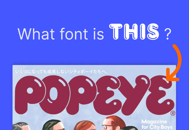
The Japan citybook magazine Popeye uses a custom font for its playful bubbly masthead.
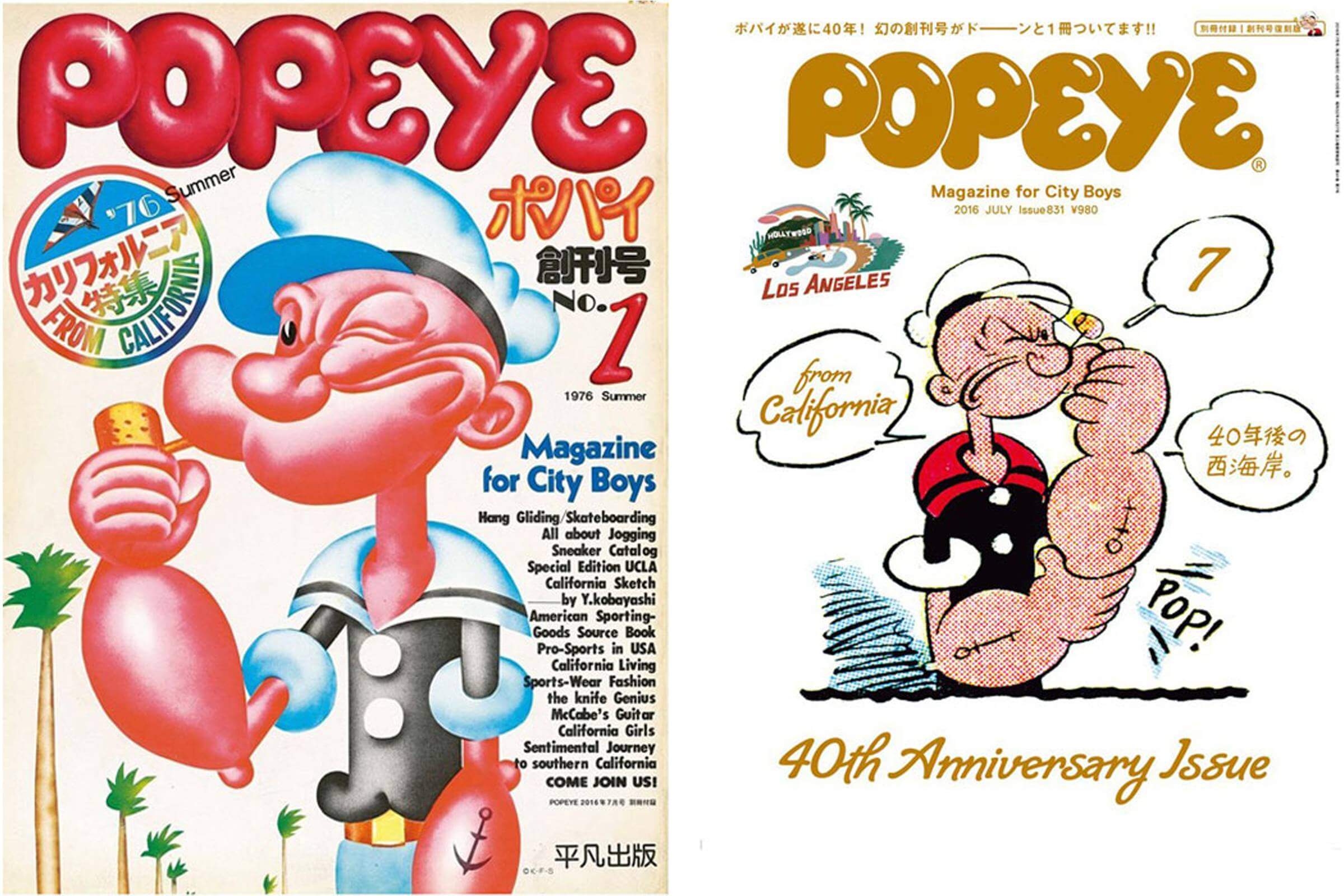
It is essentially a refined take on its original logo from 1976.

If you are looking for a similar alternative, you can consider the Frankfurter Highlight font.
The Popeye masthead features playful bold lettering that captures the magazine's youthful energy and street culture aesthetic. The logo often appears in various colors and treatments depending on the cover theme while maintaining brand recognition. This dynamic approach reflects the magazine's connection to Tokyo's creative youth culture and ever-evolving style movements.
Popeye was founded in 1976 by editorial executives Yoshihisa Kinameri and Jirō Ishikawa. The magazine covers men's topics including fashion, culture, travel and contemporary living for young urban Japanese men. It publishes monthly with 12 issues per year.